Mcdonald's and Jack in the Box
How would you describe their brand personalities?
How are they different?
What qualities do they transmit through their brand materials?
Mcdonald's is more a happy environment for kids, basically get them while their young mentality. Their weapon of choice is Happy Meals with current and popular cartoon icons.
Jack in the Box is for the grown ups so to say, with average joes wanting freshness in their burgers. Hence the current motto, "We don't make it till you order it."
The difference of course is the logo, and the whole marketing strategies. iconic image - The Golden Arch, Jack in the box (a human with a giant head).
exciting! new! hip! - theyre always looking for the newest item, i.e (new ice coffee) - Mcdonalds
Old-fashion, "sophisticated" - They never change who they are. Always kept with the "we dont make it till you order it" attitude
Target and WalMart
How would you describe their brand personalities?
How are they different?
What qualities do they transmit through their brand materials?
Target is more sophisticated in their brand. "targeting" more younger generation. (david bowie clothing, french influence clothing line)
Wal-Mart is more depended on the older generation and the cheap price it has to offer. Kind of like a cosco without the membership. I feel they lost alot without the smiley face as their logo. The old people in the commercial are just sad now.
Verizon and Cingular
How would you describe their brand personalities?
How are they different?
What qualities do they transmit through their brand materials?
Verizon is always big on quality of service. hence the price in the monthly bill. "You get what you pay for" mentality
AT&T(cingular) cheap price - phones that connect to the younger user (iphones,razor, etc )
Now about you....
First
What three values or principles are most important to you? What matters to you?
Fun/Eclectic/Simple
Design that standout with more hand-made design in mind.
Next
What three adjectives would your friends use to describe you?
unique, eclectic, outgoing
What are the three most common things your family would say about you?
hardworking, busy, studious
List the three most common things that people might say, in describing having just met you for the first time.
Shy, funny, unique
Then
How would you describe your personality? Pick at least three distinctly different adjectives.
Blue-Collar, Outgoing, Eclectic
Now
Carefully choose three distinct descriptive terms that, taken as a set, would describe the professional design personality that you hope to transmit to potential clients or employers. These are the qualities that should be visually communicated in all your brand materials. You should be prepared to talk about this excercise in class.
eclectic, fun, simple
You may find it helpful to do a google search for “list of adjectives”, “list of characteristics” or “list of qualities” to help you with descriptive language.
Wednesday, April 30, 2008

Monday, April 28, 2008
Allan Kaprow
On Friday, April 25th CSULA reinvent "Fluids" by Allan Kaprow
I was there to partake in the activity. To get the free membership to MOCA ( of course ).


i wasn't there to watch the 8 foot high wall fall. But the experience was fun neither the less.
"The line between art and life should be kept as Fluid, and perhaps indistinct, as possible."
I don't quite understand the purpose of Allan Kaprow's work. But when i do, i will update this post.
I was there to partake in the activity. To get the free membership to MOCA ( of course ).


i wasn't there to watch the 8 foot high wall fall. But the experience was fun neither the less.
"The line between art and life should be kept as Fluid, and perhaps indistinct, as possible."
I don't quite understand the purpose of Allan Kaprow's work. But when i do, i will update this post.
Sunday, April 13, 2008
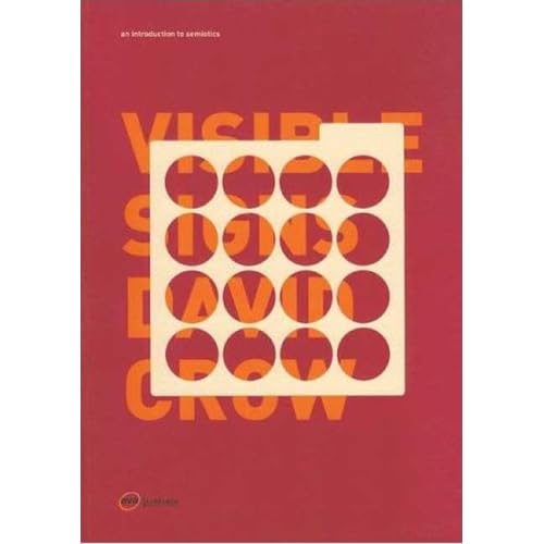
Chapter 4 Text + Image of David Crow’s Book Visible Signs.
is by far my favorite chapter. It correlates with a project that I have been planning, which involves black and white photography, painted text, and music. I want to find a common meaning in each ‘digital’ codes as Roland Barthes would describes them as “Paradigms where each of the units in the set are clearly different from each other. [As we saw in chapter 2 the two basic characteristics of a paradigm are that the units in the set have something in common and each unit is obviously different from the others in the set.]”. This chapter really helped in narrowing down the messages, and the communication involved within an advertisement. As far as my project goes, the section describing ‘RELAY’ helped a lot. Photography and Text are pretty much set in the work, the key is incorporating music into those other digital codes. I’m hoping the text acts as a Anchorage, and the music is the RELAY function which will be “supplying meanings which are not to be found in the images themselves, as in film dialogue”.


Sunday, April 6, 2008
Last Day at REDCAT: Two Lines Align

Geoff McFetridge (left), Michael Worthington (right)

Ed Fella.
So a little birdy name Jimbo told me about this event:
April 6, 2008
ED FELLA AND GEOFF MCFETRIDGE
Join REDCAT artists Ed Fella and Geoff McFetridge in a lively conversation about the evolution of graphic design, the vernacular, and the dueling bedfellows of fine art and design on the last day of their exhibition Two Lines Align: Drawings and Graphic Design by Ed Fella and Geoff McFetridge. Curator Michael Worthington will also be present. Book signing to follow artists talk.
my reaction to this was "WOW!" a legend in Ed Fella, and an up and coming designer in Geoff McFetridge at the same place talking about their work!.
What i got of this event is the different designers go through different process depending on the era they lived in. Ed going against commercial art and geoff using commercial art. In a way, corporate has seen a use for post-modern art/ design because it gets the younger generation to buy their product.
Saturday, April 5, 2008
Reading The Sign

John Hood, a graphic artist for Caltrans
After nearly 100 deaths reported in 1990. Caltrans was given a assignment of creating a sign that motorist could see right away, The sign had to be easily recognizable so they could be cautious of group of people running across the freeway. The sign went through many drafts, some had eyes and other feature, another had a mother juggling a baby. All of them had to be rejected because of its complicated nature for drivers going 65 mph.
The finish product a silhouette of a family; father, mother, and daughter running, with one word - CAUTION - placed on top of the sign.
Chapter 3 of this book
READING THE SIGN
The meaning of any sign is affected by who is reading that sign.
For me, the sign i thought was a joke of some sort making fun of immigrants. Growing up i heard alot of jokes about it.
The connotation of the sign became a stereotype symbol. After reading this article in LATIMES, the stigma has been lifted.
Tuesday, April 1, 2008
blogspot is confusing!
i cant drag anything, add friends, or complete any editing to the layout. Im growing impatient.
Subscribe to:
Posts (Atom)