
John Hood, a graphic artist for Caltrans
After nearly 100 deaths reported in 1990. Caltrans was given a assignment of creating a sign that motorist could see right away, The sign had to be easily recognizable so they could be cautious of group of people running across the freeway. The sign went through many drafts, some had eyes and other feature, another had a mother juggling a baby. All of them had to be rejected because of its complicated nature for drivers going 65 mph.
The finish product a silhouette of a family; father, mother, and daughter running, with one word - CAUTION - placed on top of the sign.
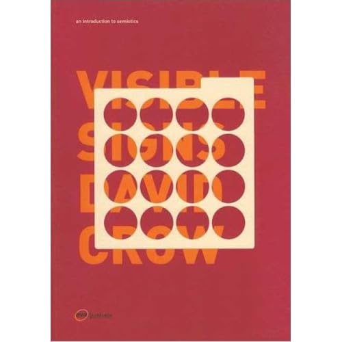
Chapter 3 of this book
READING THE SIGN
The meaning of any sign is affected by who is reading that sign.
For me, the sign i thought was a joke of some sort making fun of immigrants. Growing up i heard alot of jokes about it.
The connotation of the sign became a stereotype symbol. After reading this article in LATIMES, the stigma has been lifted.

2 comments:
Man, the cover of the book is so sweet.
wow took a hundred deaths b4 Cal Trans does anything thats funny :p
Post a Comment